Color Palettes That Feel Timeless
April 2026
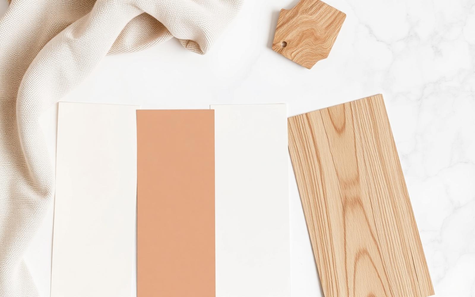
From warm ivory to soft stone, we break down the neutral palettes that create cohesion and calm across every room.
Trends in home color come and go fast. One year everything is greige, the next it's "millennial gray," and the year after that everyone's suddenly painting an accent wall the color of a dark forest. If you're staging a home to sell — or just want a space that won't feel dated in five years — the safest, smartest move is to build around a neutral palette that flatters the architecture instead of chasing the moment.
Here's how we think about neutrals, and the palettes we come back to again and again.
Why Neutral Doesn't Mean Boring
A good neutral palette isn't the absence of color — it's color pulled back just enough to let light, texture, and architecture do the talking. Warm ivories, soft stones, and muted taupes all carry undertones of yellow, pink, or gray, and choosing the right undertone for a space is what separates "calm and cohesive" from "flat and lifeless."
The goal in staging is always the same: create a backdrop broad enough that any buyer can picture their own furniture, art, and life in the space — without the room ever feeling sterile.
Warm Ivory
Ivory is one of the most forgiving neutrals there is. It reads as clean and bright without the cold, clinical feel that stark white can bring, especially in rooms with limited natural light.
- Best for: living rooms, entryways, and older homes with warm wood tones already in the trim or flooring.
- Pairs well with: brass hardware, natural linen, warm wood furniture.
- Watch for: ivory can lean yellow under certain LED bulbs — always test a swatch under the room's actual lighting before committing.
Soft Stone
Stone tones sit between beige and gray, and they're some of the most versatile wall colors available right now. They shift subtly with the light throughout the day, which gives a room a sense of depth that flat white or beige can lack.
- Best for: main living spaces, hallways, and rooms that connect to several other spaces, since stone tends to transition cleanly from room to room.
- Pairs well with: black or matte bronze fixtures, greenery, woven textures.
- Watch for: in north-facing rooms, stone can read slightly cooler and grayer than expected — a warmer stone shade helps counteract that.
Muted Taupe
Taupe brings a little more richness and grounding than ivory or stone, without tipping into a bold, trend-driven color. It works especially well as a way to add warmth to larger rooms without darkening them.
- Best for: primary bedrooms, dining rooms, and spaces meant to feel a bit more intimate or cozy.
- Pairs well with: cream textiles, natural wood, soft greens.
- Watch for: pick a taupe with enough gray in it that it doesn't drift pink or lavender in low light.
Cool Greige
For homes with a more modern architectural style, a cool greige (gray with a hint of beige) offers a crisp, contemporary feel while still staying neutral enough not to alienate any buyer's taste.
- Best for: kitchens, bathrooms, and newer-construction homes with clean architectural lines.
- Pairs well with: matte black fixtures, white oak, marble or quartz surfaces.
- Watch for: greige can feel a little cold on its own — balance it with warm-toned decor and natural materials.
Building a Palette, Not Just Picking a Color
The real trick to a timeless look isn't picking one perfect neutral — it's building a small palette of two or three complementary tones and carrying them consistently through the home. A common approach:
- A base wall color used through the main living spaces for flow and cohesion.
- A slightly warmer or cooler variation for bedrooms or more intimate rooms.
- A grounding tone — often in trim, cabinetry, or larger furniture pieces — that ties everything together.
When these tones are chosen with the same undertone family in mind (all warm, or all cool), the whole home feels intentional and calm rather than like a patchwork of individual room decisions.
Why This Matters When You're Selling
Buyers respond to homes that feel move-in ready, and a cohesive neutral palette does a lot of that work before a single piece of furniture is placed. It photographs well, it flatters natural light at every hour, and it gives buyers a blank enough canvas to start picturing their own life in the space — which is, at the end of the day, the entire goal of staging.
If you're not sure which palette fits your home's light, layout, and architecture, that's exactly the kind of thing we walk through during a staging consultation — matching the palette to the house instead of the other way around.