The Art of Quiet Luxury Interiors
July 2026
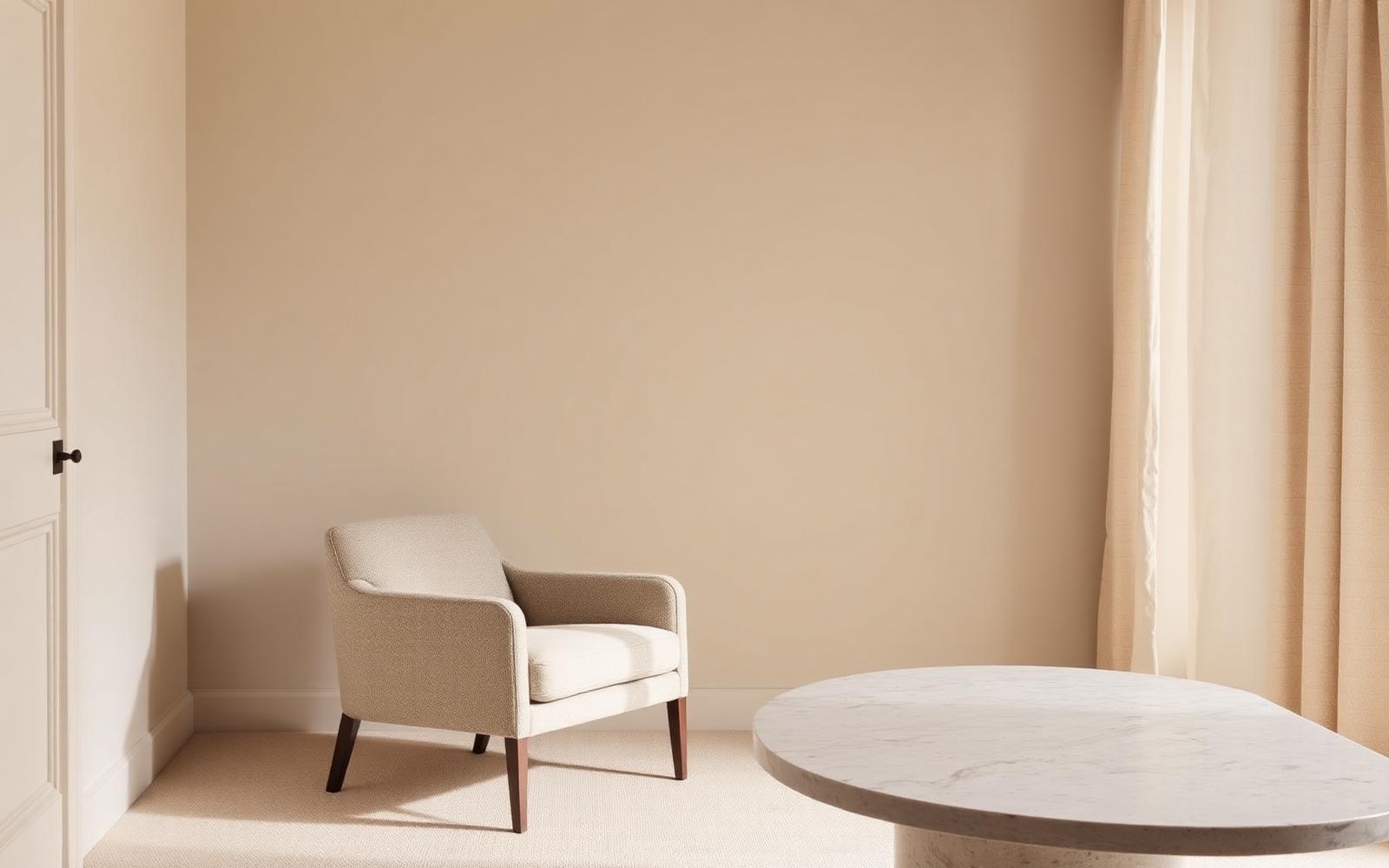
Less noise, more intention. Discover the principles behind calm, elevated spaces that feel expensive without trying too hard.
Quiet luxury has become a familiar phrase in fashion, but the same idea applies just as directly to interiors. It's not about visible logos or obvious price tags — it's about spaces that feel expensive because of restraint, not despite it. A quiet luxury room doesn't announce itself. It just feels right the moment you walk in, and it usually takes a second look to figure out why.
The irony is that this look is often harder to achieve than a maximalist one. There's nowhere to hide a wrong decision when the whole point is intention. Here's what actually creates that feeling.
Restraint Over Statement
The first principle of quiet luxury is simple: fewer, better things. A room filled with statement pieces competing for attention reads as busy, no matter how expensive each individual item is. A room built around a handful of well-chosen pieces, with room to breathe around each one, reads as considered.
This means resisting the urge to fill every wall, shelf, and surface. Negative space isn't wasted space — it's what allows the pieces that are there to actually be seen.
Texture Does the Work Color Usually Does
Quiet luxury spaces tend to lean into a narrow, neutral color range — but they avoid feeling flat by relying heavily on texture instead of color to create interest. Linen, boucle, raw wood, brushed metal, honed stone: these materials carry visual weight and depth even within a tight, monochromatic palette.
The layering matters as much as the materials themselves. A room with three or four different textures in the same tonal family (a nubby wool rug, a smooth linen sofa, a matte ceramic vase) feels rich in a way that flat, single-texture rooms don't, even at the exact same color palette.
Quality Over Quantity, Visibly
This look depends on choosing fewer pieces that are genuinely well made, rather than more pieces that only look the part. That often shows up in small details:
- Furniture with real joinery and solid construction rather than pieces that look right in a photo but feel flimsy in person.
- Hardware, fixtures, and fittings with actual weight and finish quality, since these are some of the first things a hand notices even if the eye doesn't consciously register them.
- Fabrics that age well — natural fibers that soften and improve over time rather than pilling or fading quickly.
The goal isn't to spend the most on every item. It's to be deliberate about where quality is most visible and tactile, and to be comfortable being simpler elsewhere.
Consistent Undertones Throughout
One of the fastest ways to undercut a calm, elevated feeling is mixing warm and cool tones without intention — warm wood next to cool gray stone, or brass fixtures next to blue-toned white walls. Quiet luxury interiors tend to commit to one undertone family (all warm or all cool) throughout a space, which is part of why they feel so cohesive and unified even though the palette itself is narrow.
This applies to metals, wood tones, wall colors, and textiles alike. Consistency in undertone does more to create a sense of "expensive" than any single expensive object could on its own.
Function Hidden in Plain Sight
Quiet luxury spaces rarely look overtly "styled" with visible organizing systems, cords, or clutter — but they're not empty either. Everyday function is simply designed to stay out of view: closed storage instead of open shelving stacked with visible items, hidden charging stations, drawer organization that keeps surfaces clear.
The apparent simplicity of the room is often the result of a lot of invisible planning, not an absence of things to store.
Lighting That Feels Natural, Not Staged
Lighting plays a bigger role in this aesthetic than most people expect. Harsh overhead lighting flattens a room and undercuts the calm, elevated feeling almost instantly. Quiet luxury spaces tend to favor:
- Layered lighting — a mix of ambient, task, and accent light sources rather than one central overhead fixture.
- Warmer color temperatures that flatter skin tones and natural materials.
- Light fixtures chosen with the same restraint as furniture — a well-proportioned, simple fixture over anything ornate or attention-seeking.
Why This Approach Works for Staging
This aesthetic photographs exceptionally well and appeals to a wide range of buyers, because it doesn't rely on a specific trend or bold personal taste to land. A calm, considered space reads as high-end regardless of a buyer's individual style preferences, which makes it one of the most broadly effective looks for staging a home that needs to appeal to as many people as possible.
It also tends to be more forgiving of a home's existing bones than a heavily trend-driven look — quiet luxury is less about adding a lot, and more about editing well and choosing carefully, which makes it achievable in almost any space with the right guidance.
If you're picturing this kind of calm, elevated feel for your own listing, that's exactly the kind of look we specialize in bringing to life — matched to your home's architecture and light, not just a mood board.